
Color Theory

Color Theory

» Engagement » Elements » Color » Color Theory


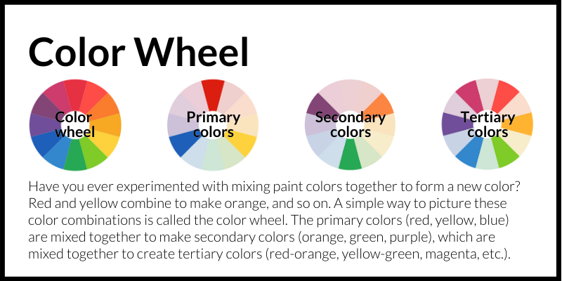
Color Wheel: Have you ever experimented with mixing paint colors together to form a new color? Red and yellow combine to make orange, and so on. A simple way to picture these color combinations is called the color wheel. The primary colors (red, yellow, blue) are mixed together to make secondary colors (orange, green, purple), which are mixed together to create tertiary colors (red-orange, yellow-green, magenta, etc.).
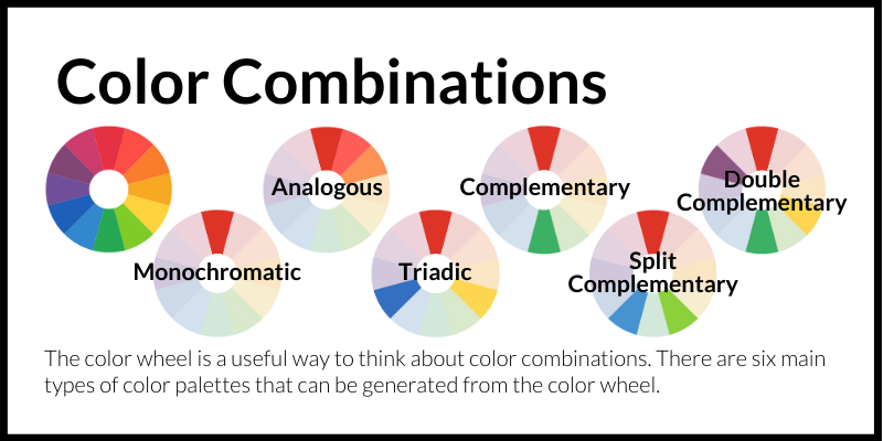
Color Combinations: The color wheel is a useful way to think about color combinations. There are six main types of color palettes that can be generated from the color wheel.
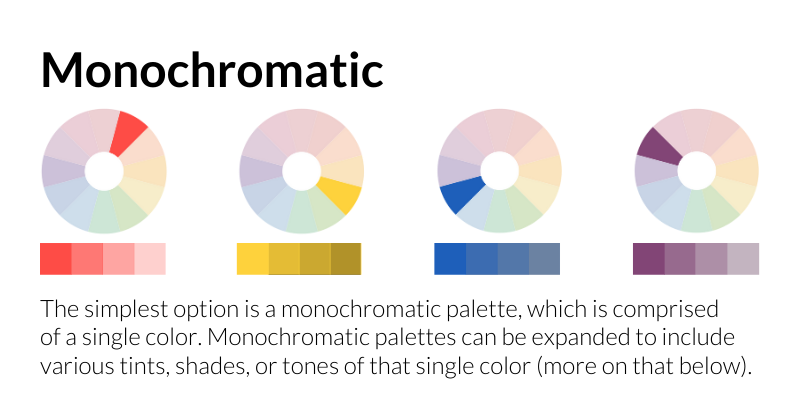
Monochromatic: The simplest option is a monochromatic palette, which is comprised of a single color. Monochromatic palettes can be expanded to include various tints, shades, or tones of that single color (more on that below).
Monochromatic paletts utilize contrasting tones.
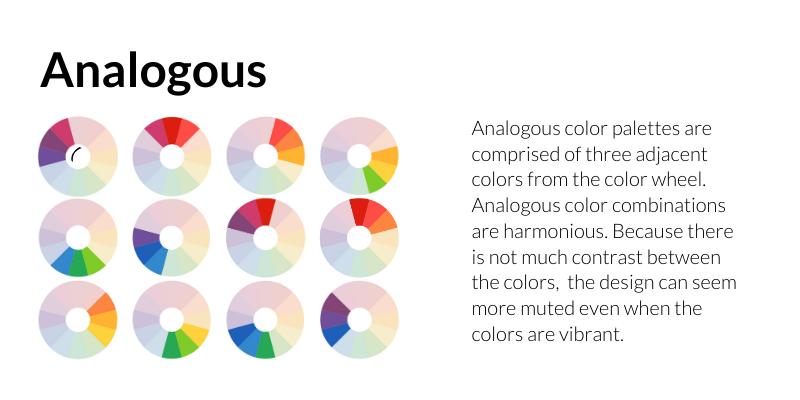
Analogous: Analogous color palettes are comprised of three adjacent colors from the color wheel. Analogous color combinations are harmonious. Because there is not much contrast between the colors, the design can seem more muted even when the colors are vibrant.
Analogous palettes create a harmonious composition.
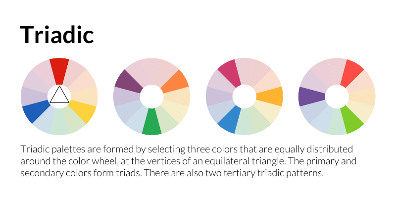
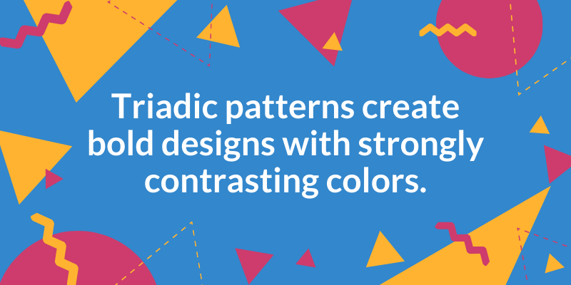
Triadic: Triadic palettes are formed by selecting three colors that are equally distributed around the color wheel, at the vertices of an equilateral triangle. The primary and secondary colors form triads. There are also two tertiary triadic patterns.
Triadic patterns create bold designs with strongly contrasting colors.
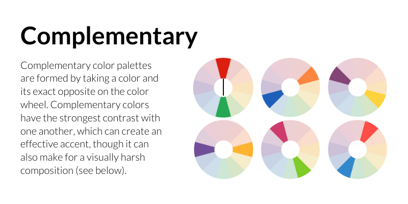
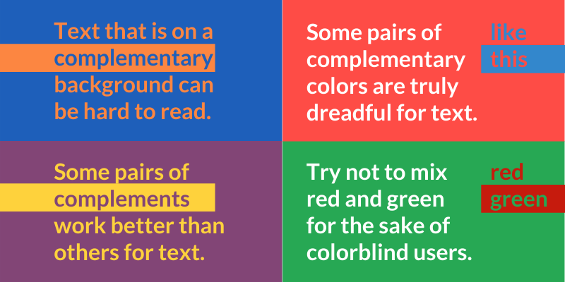
Complementary: Complementary color palettes are formed by taking a color and its exact opposite on the color wheel. Complementary colors have the strongest contrast with one another, which can create an effective accent, though it can also make for a visually harsh composition (see below).
Text that is on a complementary background can be hard to read. Some pairs of complements work better than others for text. Some pairs of complementary colors are truly dreadful for text. Try not to mix red and green for the sake of colorblind users.
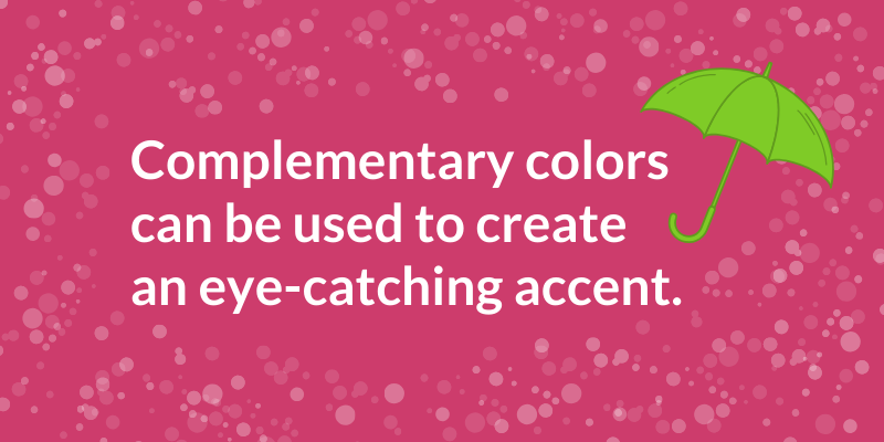
Complementary colors can be used to create an eye-catching accent.
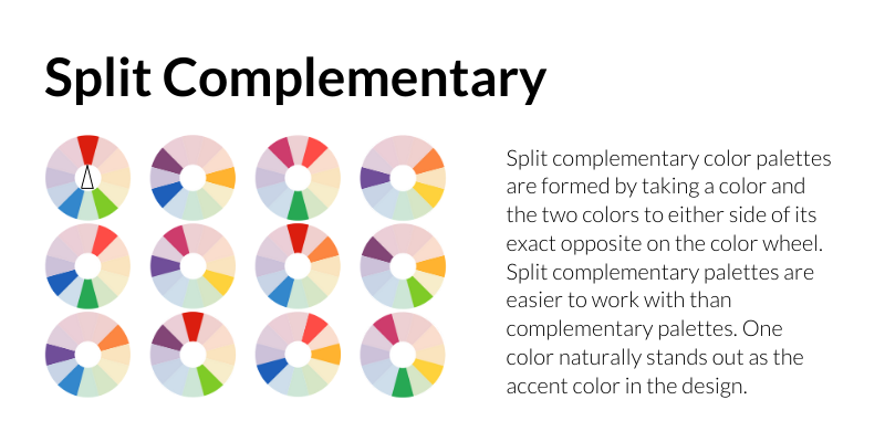
Split Complementary: Split complementary color palettes are formed by taking a color and the two colors to either side of its exact opposite on the color wheel. Split complementary palettes are easier to work with than complementary palettes. One color naturally stands out as the accent color in the design.
Split complementary color palettes are easy to use effectively.
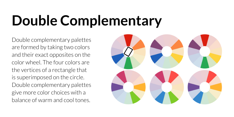
Double Complementary: Double complementary palettes are formed by taking two colors and their exact opposites on the color wheel. The four colors are the vertices of a rectangle that  is superimposed on the circle. Double complementary palettes give more color choices with a balance of warm and cool tones.
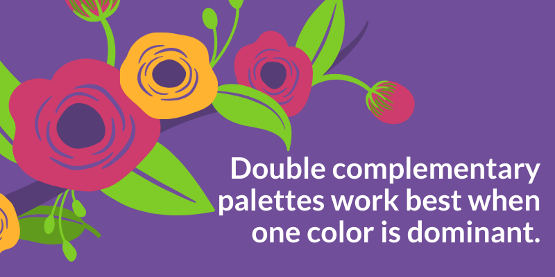
Double complementary palettes work best when one color is dominant.
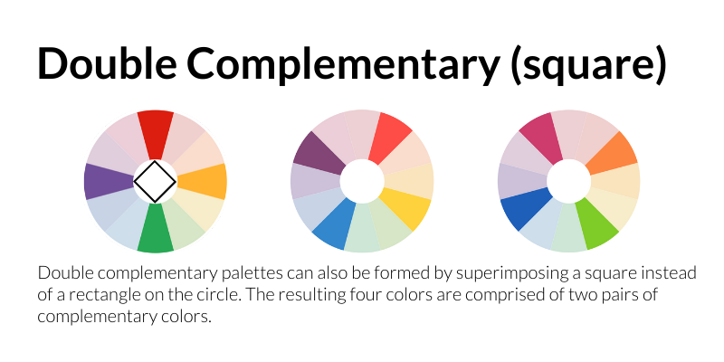
Double Complementary (square): Double complementary palettes can also be formed by superimposing a square instead of a rectangle on the color wheel. The resulting four colors are comprised of two pairs of complementary colors.
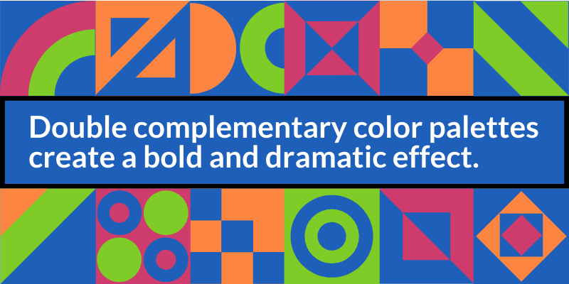
Double complementary color palettes create a bold and dramatic effect.
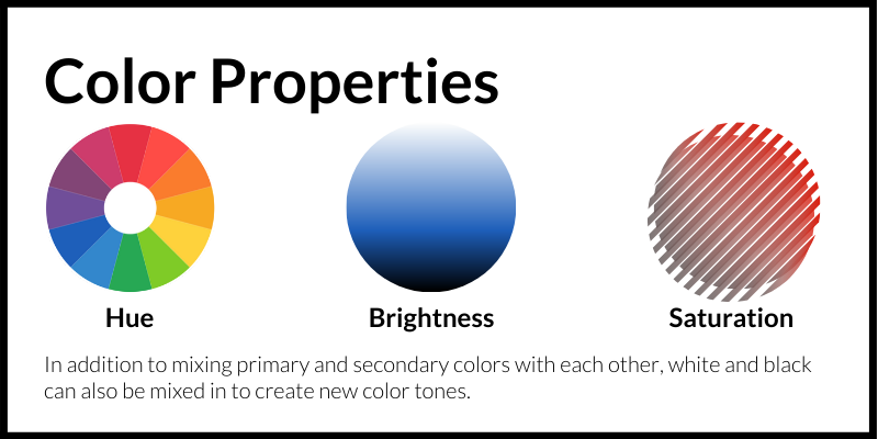
Color Properties (Hue, Brightness, Saturation): In addition to mixing primary and secondary colors with each other, white and black can also be mixed in to create new color tones.
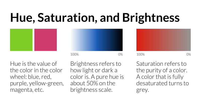
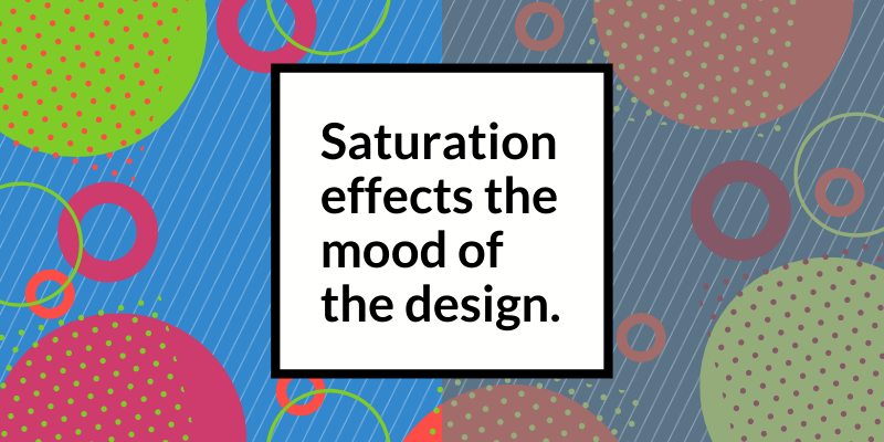
Hue, Saturation, and Brightness: Hue is the value of the color in the color wheel: blue, red, purple, yellow-green, magenta, etc. Brightness refers to how light or dark a color is. A pure hue is about 50% on the brightness scale. Saturation refers to the purity of a color. A color that is fully desaturated turns to grey.
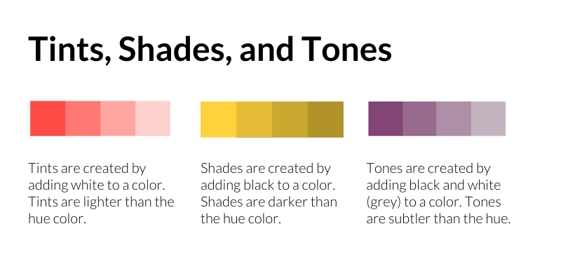
Tints, Shades, and Tones: Tints are created by adding white to a color. Tints are lighter than the hue color. Shades are created by adding black to a color. Shades are darker than the hue color. Tones are created by adding black and white (grey) to a color. Tones are subtler than the hue.
Saturation effects the mood of the design.

Additional Resources

One way to create a color palette is to use the color wheel. Adobe has an Adobe and Canva both have interactive color wheels that allow you to select a color and generate a color palette based on that color.

If you do not want to create your own palette, you can also browse a site like Design Seeds and choose a palette that works for your design.

If you would like to see how your design would look to someone who is colorblind, you can use a colorblind simulator to make sure there is enough contrast in your design.


For further reading:

Color Reference Poster by Paper Leaf.

https://creativepro.com/learning-to-use-color-your-web-site/

https://www.tigercolor.com/color-lab/color-theory/color-theory-intro.htm

https://www.tigercolor.com/color-lab/color-theory/color-harmonies.htm

https://venngage.com/blog/color-blind-friendly-palette/

Pixar Animation Studios and Khan Academy collaborated to create a series of free online courses about topics related to movie animation. One of their courses is called “Color science.” Click here to check it out.


Use of Color
Color Codes