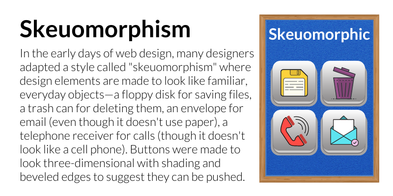
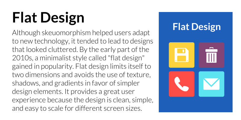
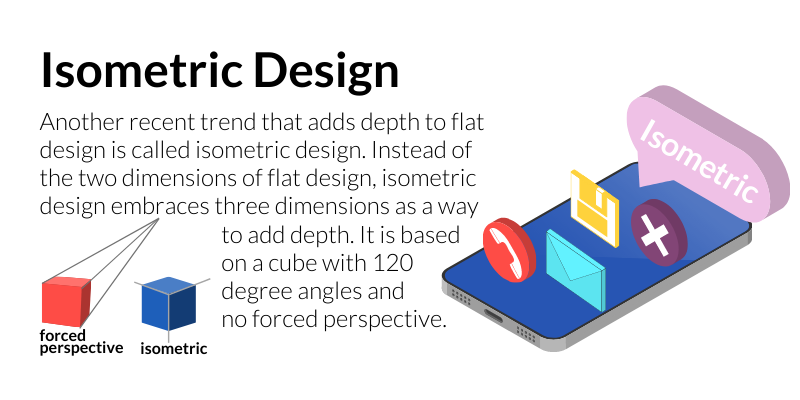
Design Trends: Dimensions

Design Trends: Dimension

SKEUOMORPHISM
In the early days of web design, many designers adapted a style called "skeuomorphism" where design elements are made to look like familiar, everyday objects—a floppy disk for saving files, a trash can for deleting them, an envelope for email (even though it doesn't use paper), a telephone receiver for calls (though it doesn't look like a cell phone). Buttons were made to look three-dimensional with shading and beveled edges to suggest they can be pushed.
FLAT DESIGN
Although skeuomorphism helped users adapt to new technology, it tended to lead to designs that looked cluttered. By the early part of the 2010s, a minimalist style called "flat design" gained in popularity. Flat design limits itself to two dimensions and avoids the use of texture, shadows, and gradients in favor of simpler design elements. It provides a great user experience because the design is clean, simple, and easy to scale for different screen sizes.
"ALMOST FLAT" DESIGN
One drawback of flat design is that with only two dimensions, it can be hard to know which design elements are meant to be clicked or tapped. By the end of the 2010s, gradients, texture, and shadow were popular once again to add dimension and depth to designs. Since the minimalist tendencies of flat design are otherwise retained, this hybrid style is known as "almost flat" or "flat 2.0."
ISOMETRIC DESIGN
Another recent trend that adds depth to flat design is called isometric design. Instead of the two dimensions of flat design, isometric design embraces three dimensions as a way to add depth. It is based on a cube with 120 degree angles and 
no forced perspective.